Financial planning widget on Overview

Summary of nine UserTesting sessions comparing a detailed planning block (goals and probability visible on scroll) with a summary layout that requires expand to see the full goal list.

n = 9 participants Order balanced: detailed variant shown as V1 for 4 users, V2 for 5 Full write-up: usertesting-analysis.md

Stakeholder takeaway

Eight of nine participants explicitly preferred the variant where goals and the probability visualization are visible on the Overview without an extra tap to reveal them. One participant preferred a collapsed default to reduce persistent noise and save vertical space, and raised important concerns about data consistency and trust in the 79% metric.

This pattern supports building the detailed-on-Overview direction as the default, while planning follow-up on CTA labeling, probability explanation, optional density controls, and prototype/data parity for future tests.

What participants saw

Each participant compared these two versions of the Financial planning widget on the Overview screen. To reduce order bias, the detailed layout was shown as Version 1 to four participants and as Version 2 to the other five.

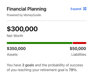
Summary variant of the Financial Planning card: net worth of $300,000 with an assets and liabilities bar, the sentence 'You have 3 goals and the probability of success of you reaching your retirement goal is 79%', and an Expand link.
Preferred by 1 Summary / collapsed Net worth plus a one-line mention of “3 goals” and 79%. Goals are only revealed by tapping Expand.
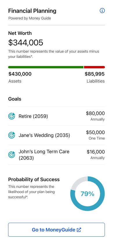
Detailed variant of the Financial Planning card: net worth of $344,005 with assets and liabilities, three named goals (Retire 2059, Jane's Wedding 2035, John's Long Term Care 2063) with amounts, a 79% probability of success donut, and a Go to MoneyGuide button.
Preferred by 8 Detailed Net worth, each goal with amount and timing, the 79% probability donut, and a “Go to MoneyGuide” button, all visible without expanding.

Note: the net worth, asset, and liability figures differ between the two mockups. This was a prototype artifact, not an intended difference, and at least one participant (Fragile) said it reduced his trust in the 79% figure.

Preference tally

8
Preferred detailed (goals visible)
1
Preferred summary / collapsed default

Caveats

What we heard

Strengths of the detailed layout

Pain points (both variants)

Design implications

By participant

“Detailed was V1” or “Detailed was V2” reflects how the prototype was labeled for that session to reduce order bias.

usertester78$ 48 · M

→ Detailed (detailed was V1)

Wants goals listed without extra click; unclear Money Guide CTA; asked for progress bars and clearer explanations of probability.

usertestingus 46 · M

→ Detailed (detailed was V1)

More scrolling OK if information is useful; motivated by visible goals; wants edit path and clearer tap targets.

darkbulb 45 · M

→ Detailed (detailed was V1)

Goals section is the differentiator; wants to drill into how 79% is composed; finds detailed block easy to scroll past.

Fragile 50 · M

→ Summary / collapsed (detailed was V1)

Does not need goals expanded every visit; flagged inconsistent numbers and doubted credibility of probability vs. goals; wants net worth higher on page.

Atrain325 43 · M

→ Detailed (detailed was V2)

Side without listed goals felt incomplete; suggested blending both layouts; prefers visible goals.

PhantomCrawford 47 · M

→ Detailed (detailed was V2)

Holistic snapshot; described preferred layout as easier to digest and not overwhelming.

mg917 52 · F

→ Detailed (detailed was V2)

Strong planning value; wants tips to improve probability; early friction treating screen as static—note for test protocol.

elb15 45 · F

→ Detailed (detailed was V2)

Named goals beat “three goals” alone; donut helped interpret partial success; expand expectations to validate in hi-fi.

mel98942 45 · F

→ Detailed (detailed was V2)

Preferred layout felt seamless; clearer path than collapsed side; net worth and goals “in one place.”
Recommended next steps

  1. Default experience: ship toward detailed-on-Overview (or hybrid with explicit goal headlines), aligned with 8/9 preference and discoverability findings.
  2. Usability pass: test CTA copy, 79% explanation pattern, and expand behavior on device with consistent data across states.
  3. Advisor & vendor: align on what surfaces in-app vs. third-party tool (editing, assumptions, disclaimers).
  4. Quant follow-up: larger sample or in-product test tied to task success, not preference alone.